Collingwood Neighbourhood House
Responsive web design - Lead : UI designer
Time line: 3 weeks
Project goal
Modify the CNH web site. Bring a better organization and navigation system to the user. The client wants to bring modernity to the site and create a welcoming feeling to the user.
Minimum viable product
Organize and modernize the existent web site.
Creating a responsive version of the site (mobile version)
Unique selling point
Showcasing who they are and what services they have to offer.
Target market
35 + year-old from the neighbourhood
Challenges
Establish an architecture system with all the documentation for a Local Neighbourhood House
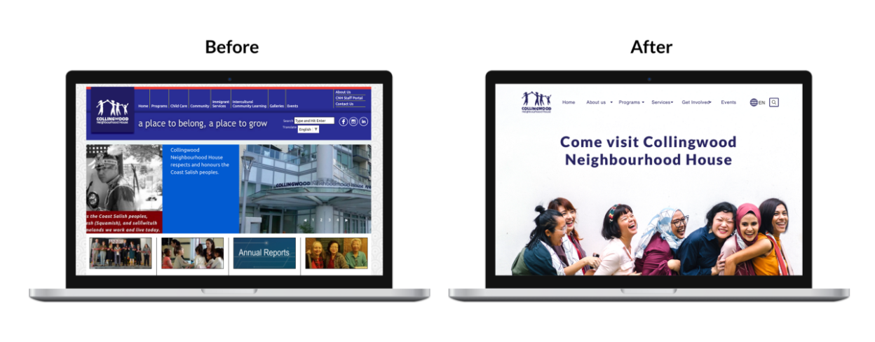
Website is outdated to the point where even current staff avoided directing any community members to the site.
Redesign the visual of the site to follow the current design and tech trend
We determined that there were two main tasks we would need to tackle
1. Information architecture
2. Create a welcoming experience to the user
Research
The first part of our design process include:
Domain research, user interviews and surveys
Affinity diagram to organize our findings.
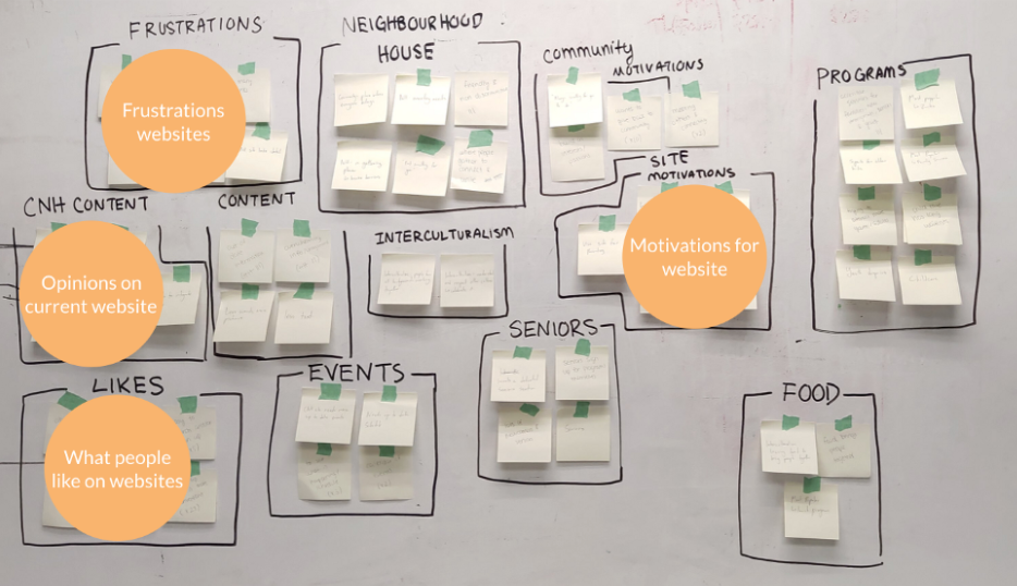
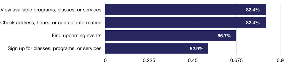
Reasons people visited websites for a community centre or neighbourhood house:
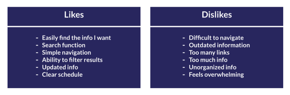
What people liked and disliked about websites for community centres or neighbourhood houses:
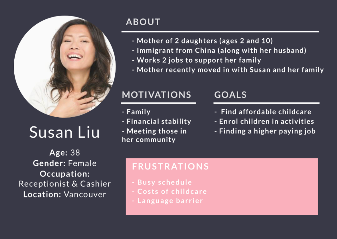
Persona
After speaking to the staff at CNH to understand their users and analyzing the research from our interviews and surveys, we created the following persona.
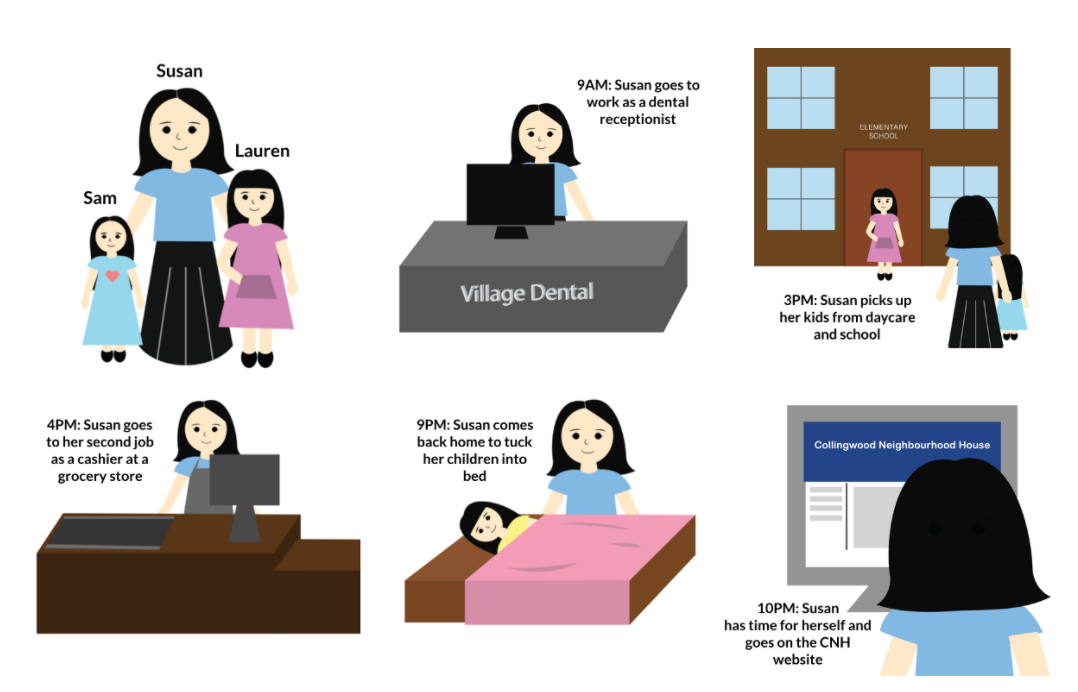
Storyboard
We created a storyboard to illustrate what is Susan’s life might look like and
identify reasons why she should use the CNH website.
Information Architecture
Considering how a lot of current user frustrations revolve around the content within the CNH website, our team focused heavily on the information architecture of the website.
There were 4 steps we took to tackle the information architecture:
Staff interviews, content audits, brochure review and card sorting
First level of categorization
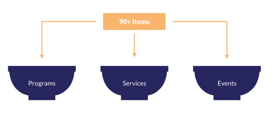
Second level of categorization
(within these buckets would be the demographic breakdown)
Third level of categorization
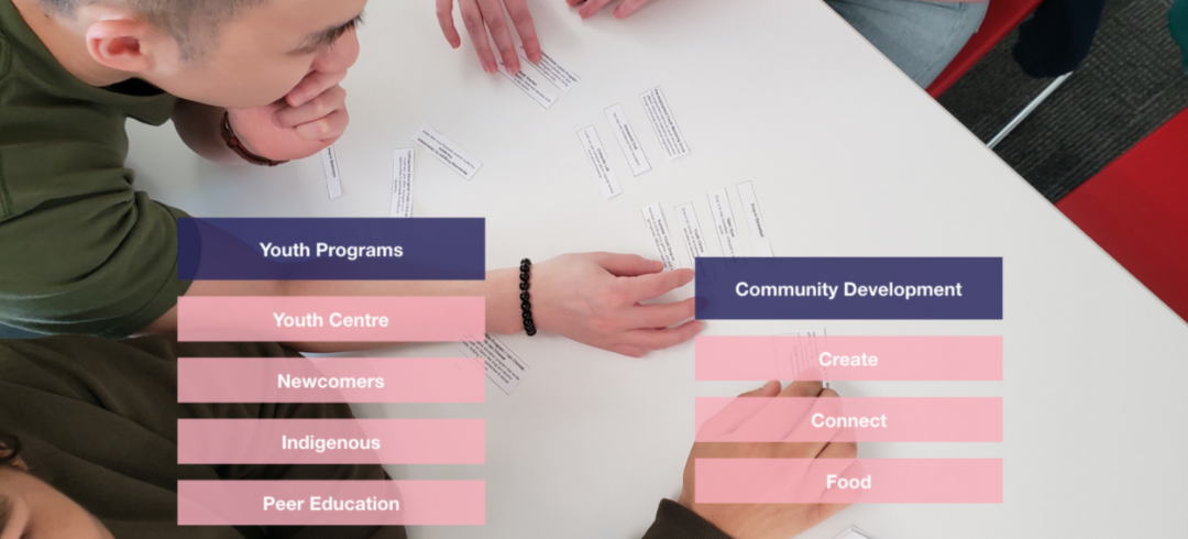
(Youth Programs and Community Development)
We used the card sorting method because those categories/items were more dense than the others and our team found it more challenging to group them within these areas.
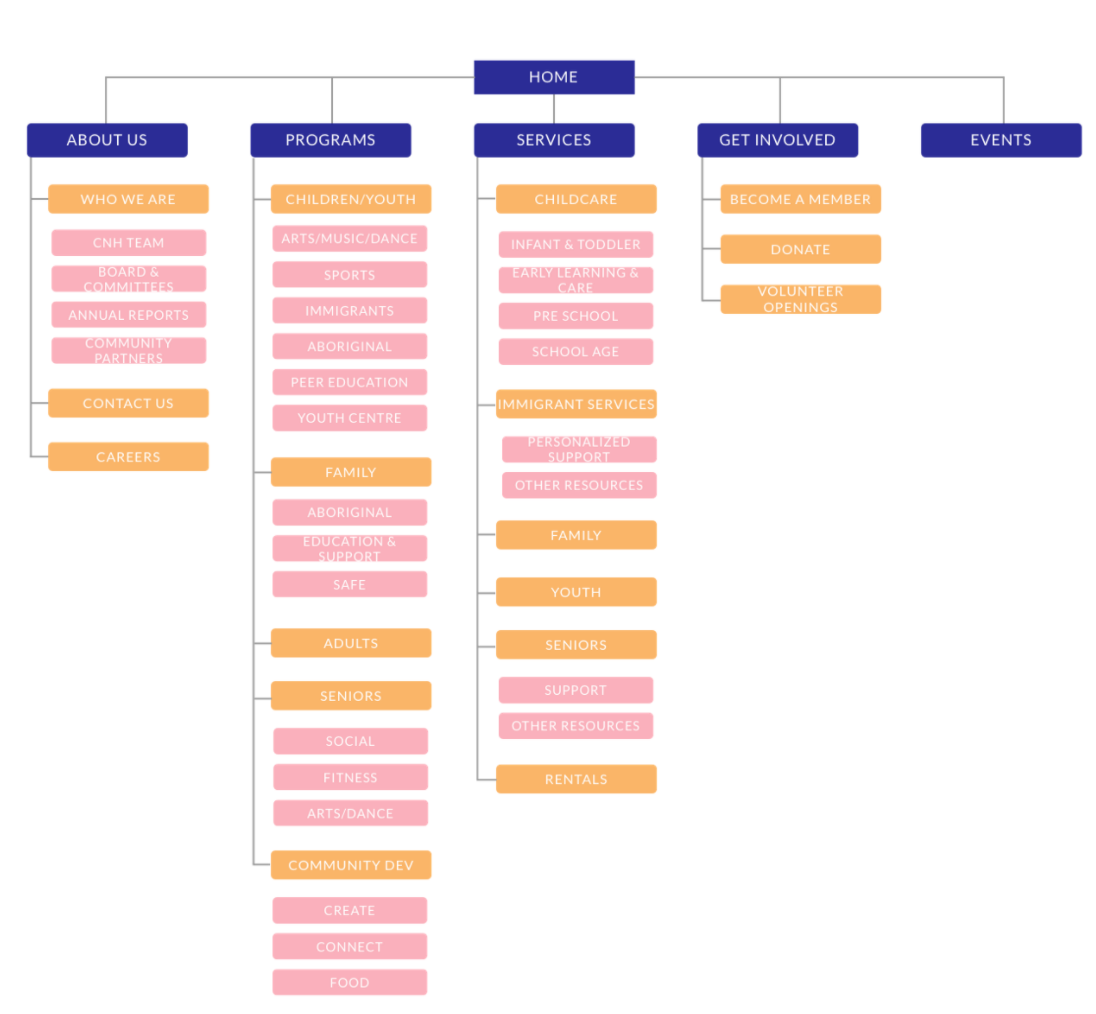
Site map
After figuring out all the titles of all our levels of categorization, our team was able to create
a sitemap for the CNH website
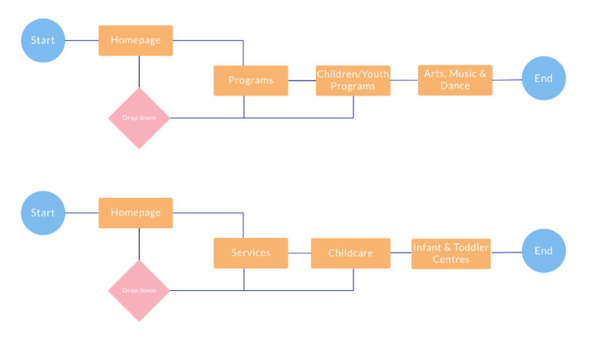
User flow
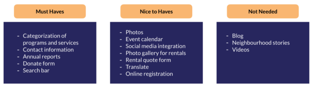
Feature Prioritization
Design
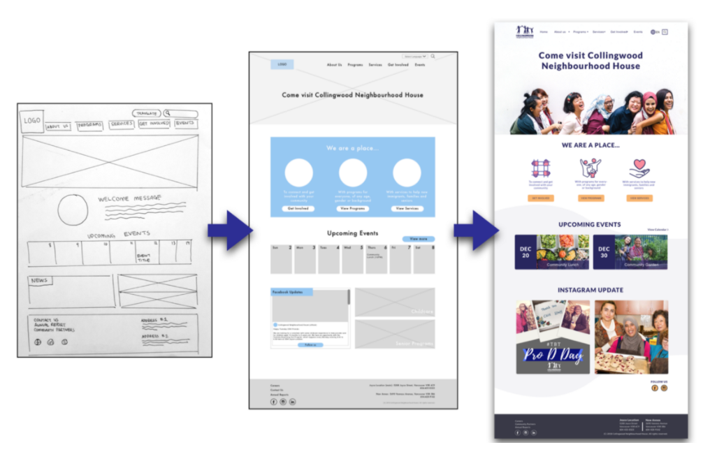
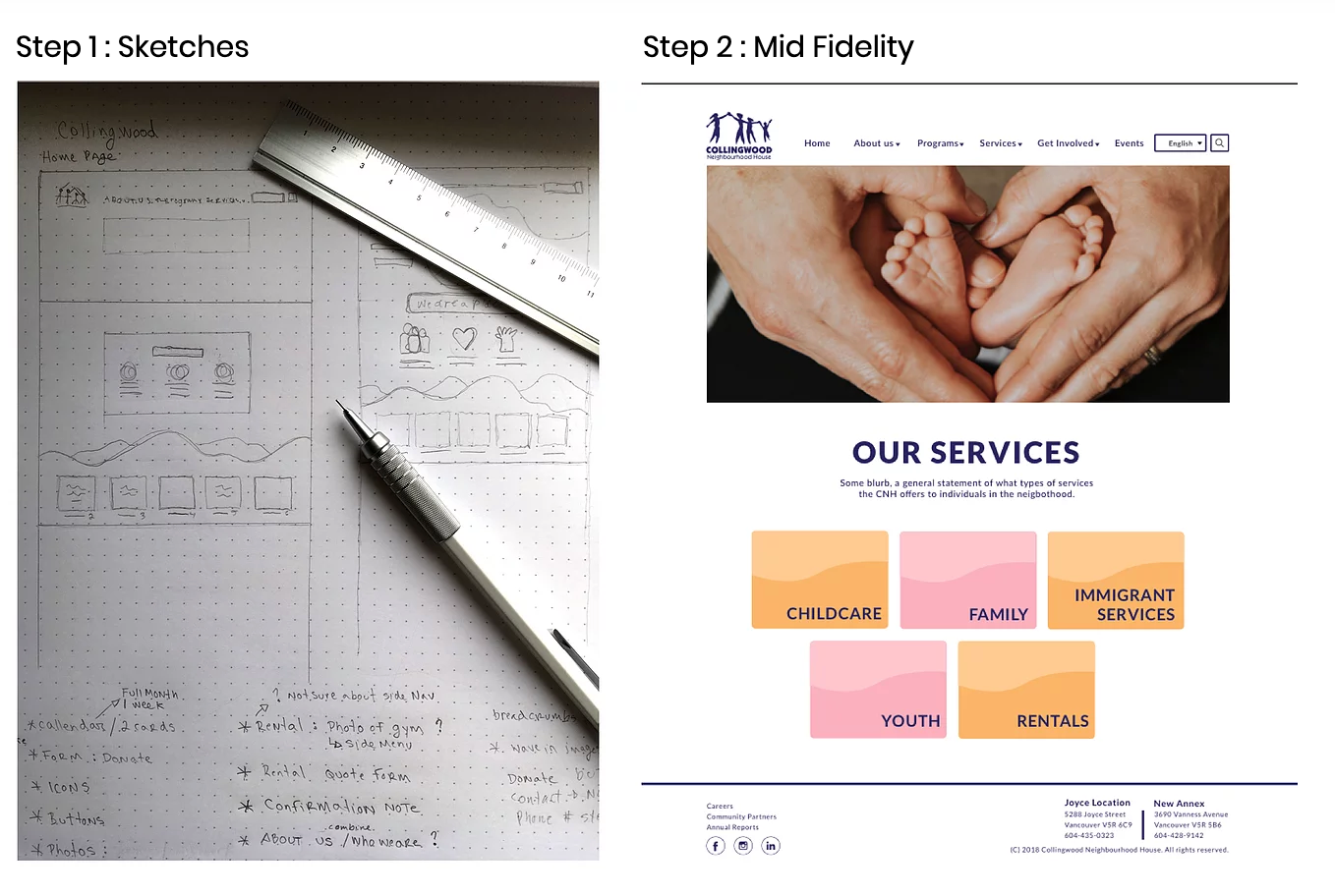
Sketch
Mid-fidelity prototypes
Testing
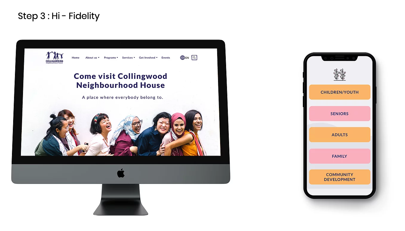
High-fidelity prototypes
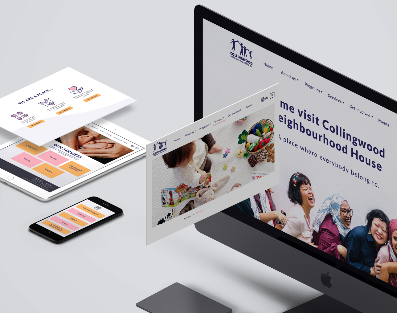
Launching
UI design process
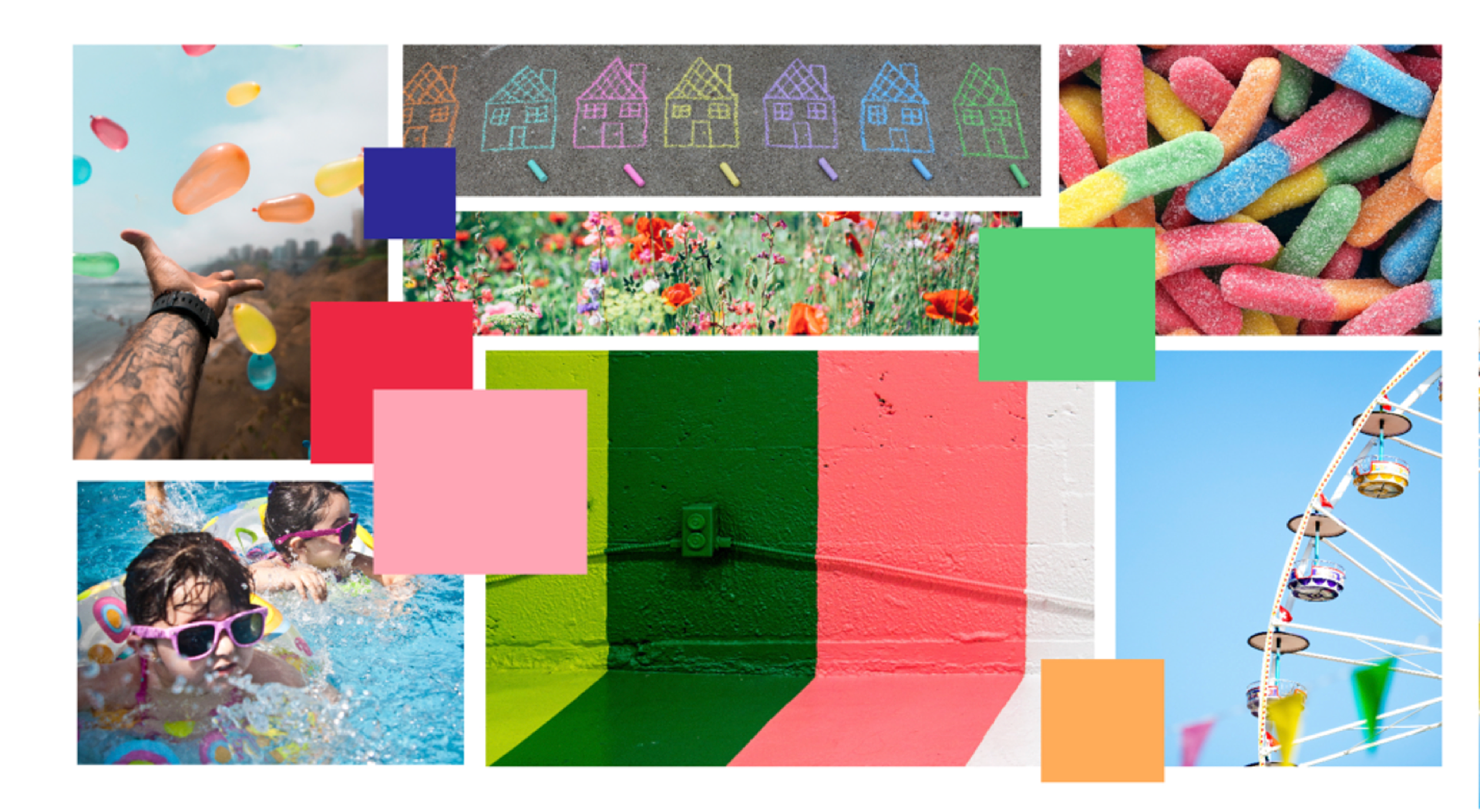
Research / Moodboard
Direction #1: Bright & Cheerful
Direction #2: Calm & Friendly
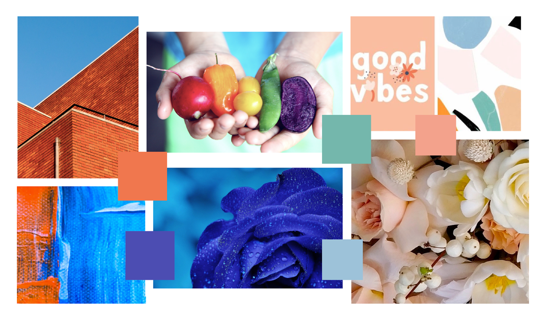
The clients choose the first option.
Bright & Cheerful
Style tile
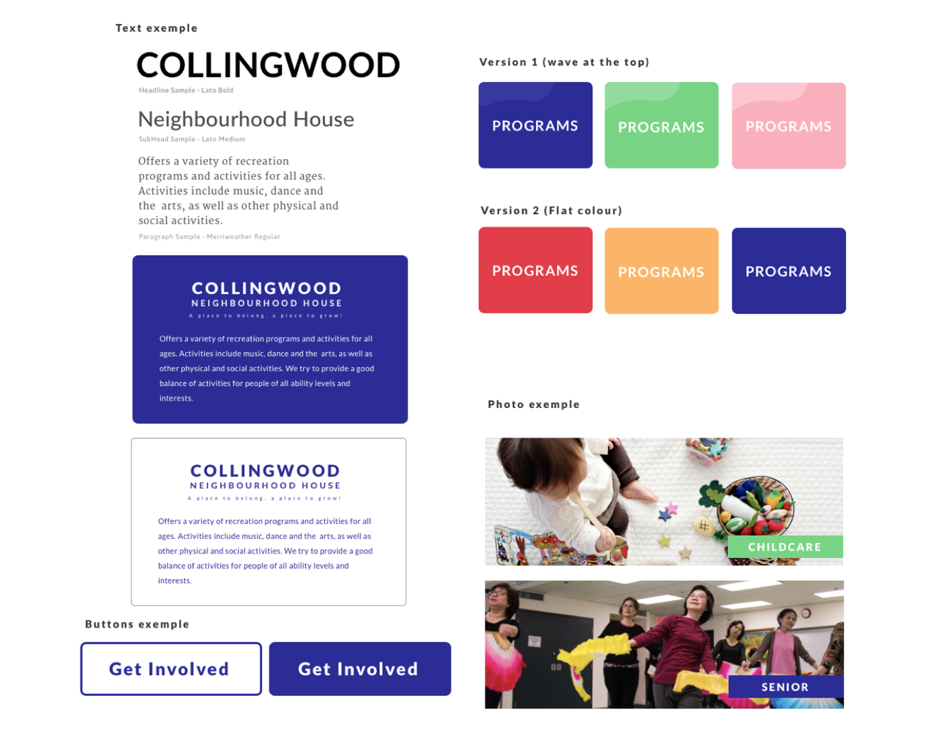
But after testing this concept with some users, We find out that people were getting a bit confused with the colours.
People were associating the colour to the different categories. Also by using images on each screen which contain a lot of colours it was getting a little too messy. We wanted to keep the screen minimal & professional.
We adjusted the final direction base on those feedbacks.
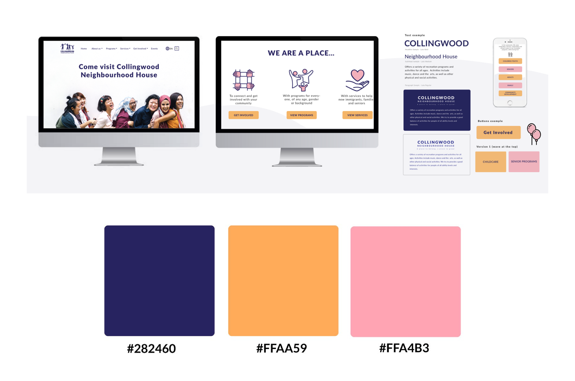
Visual process